


Type Design
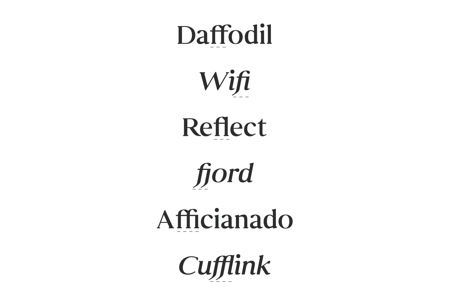
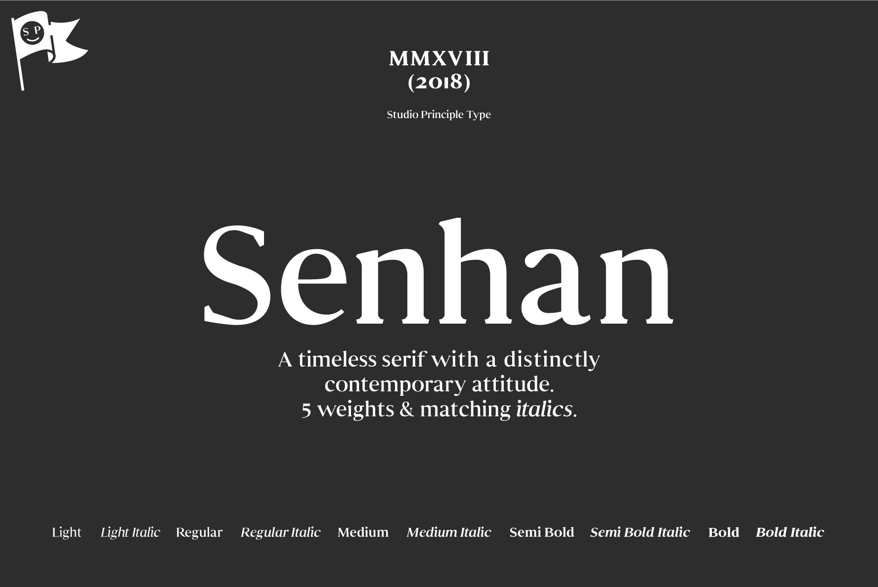
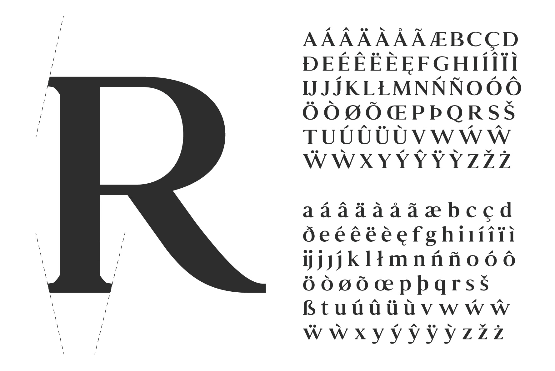
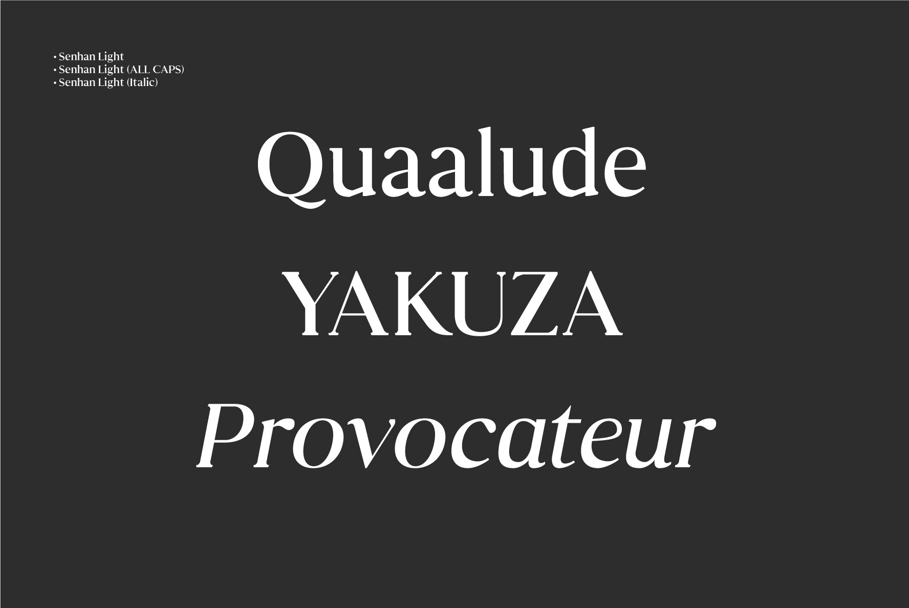
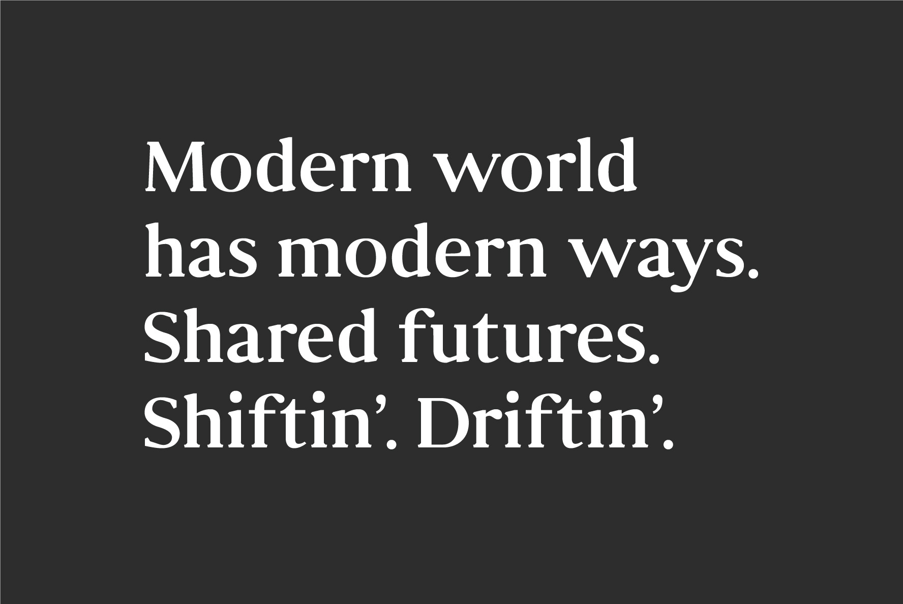
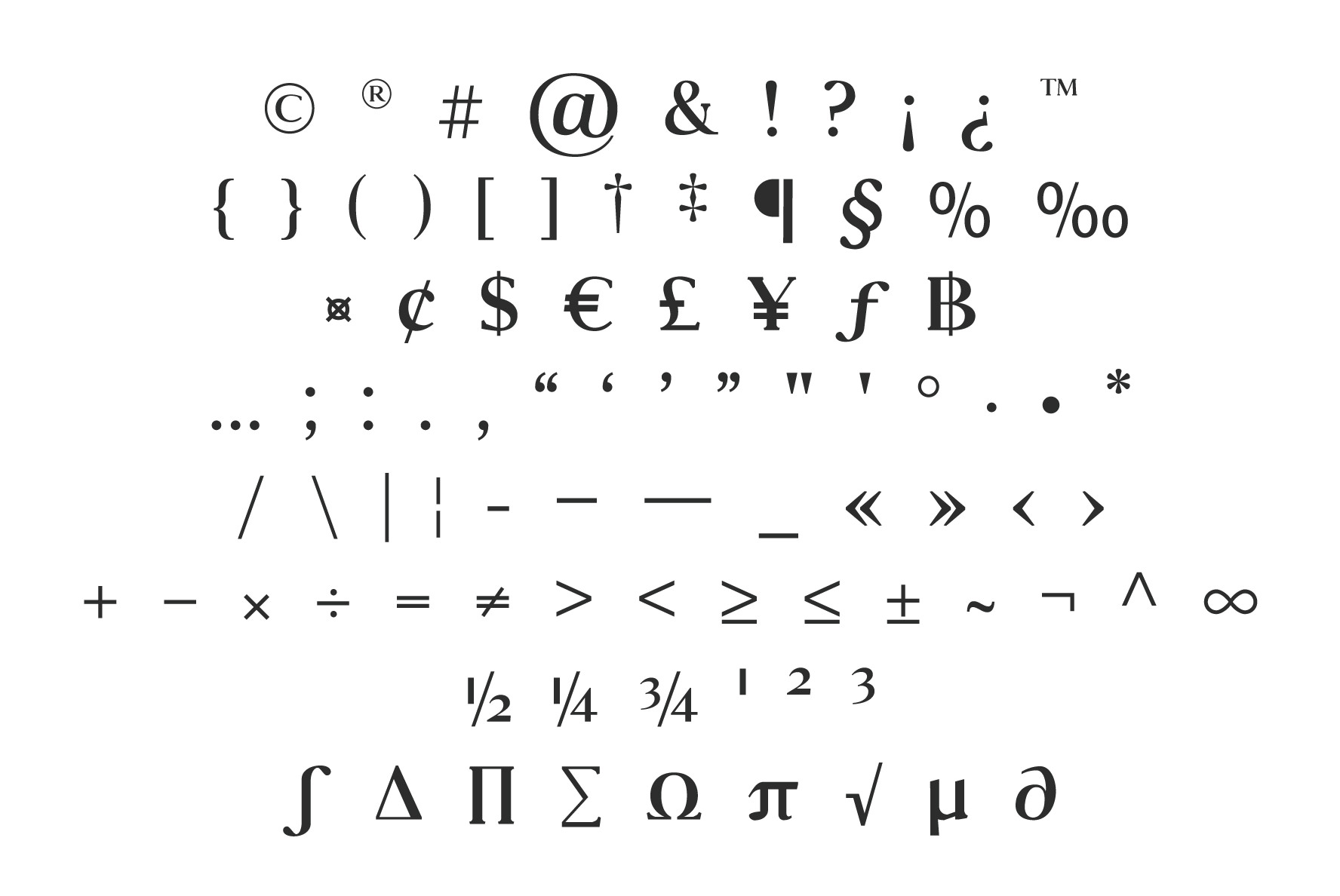
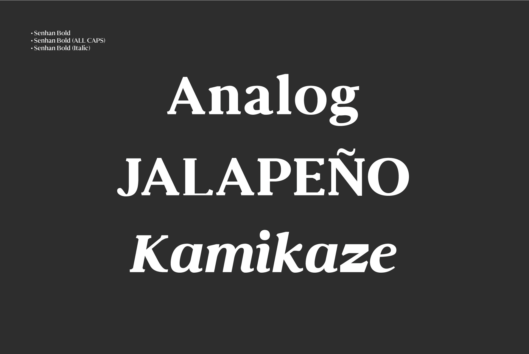
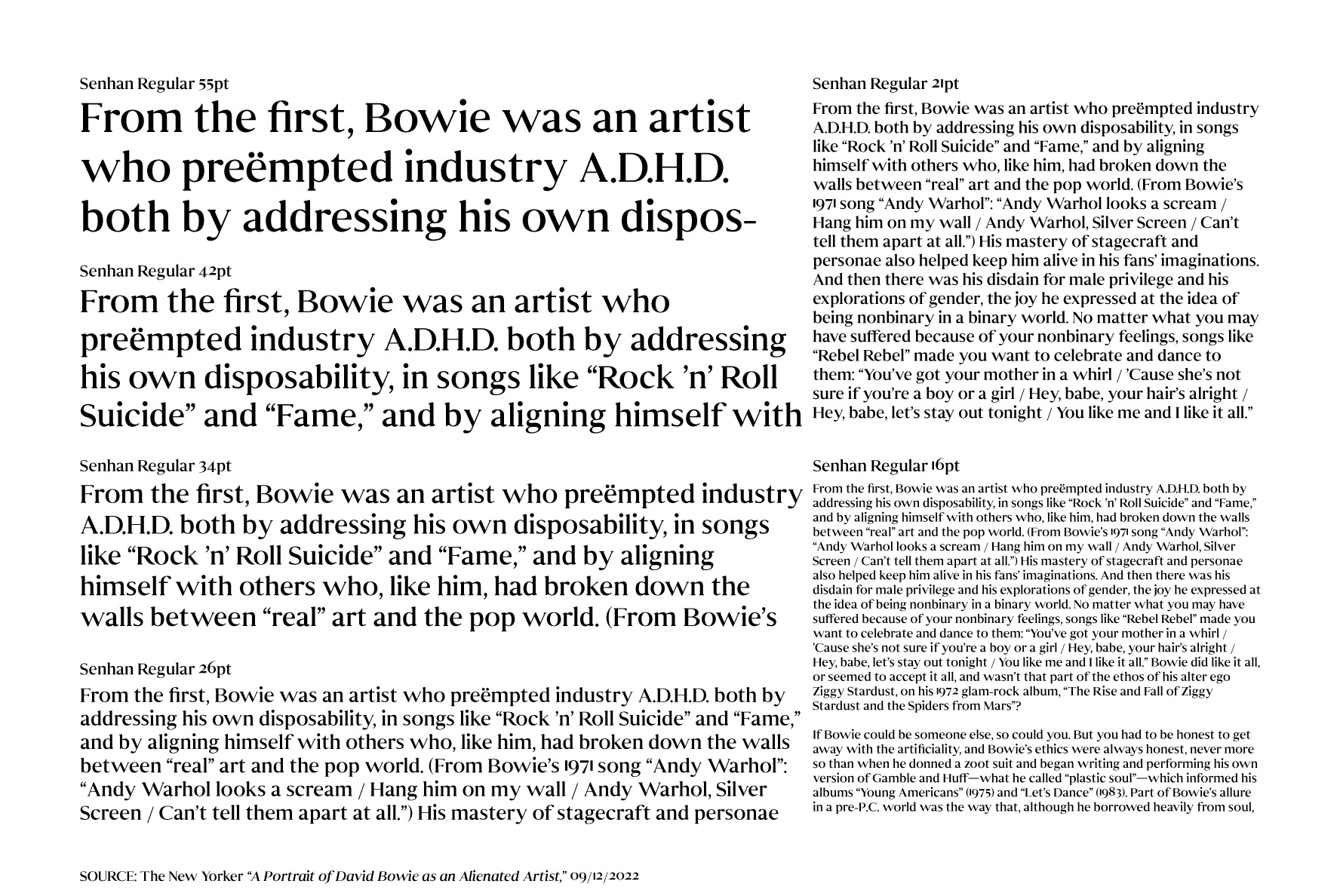
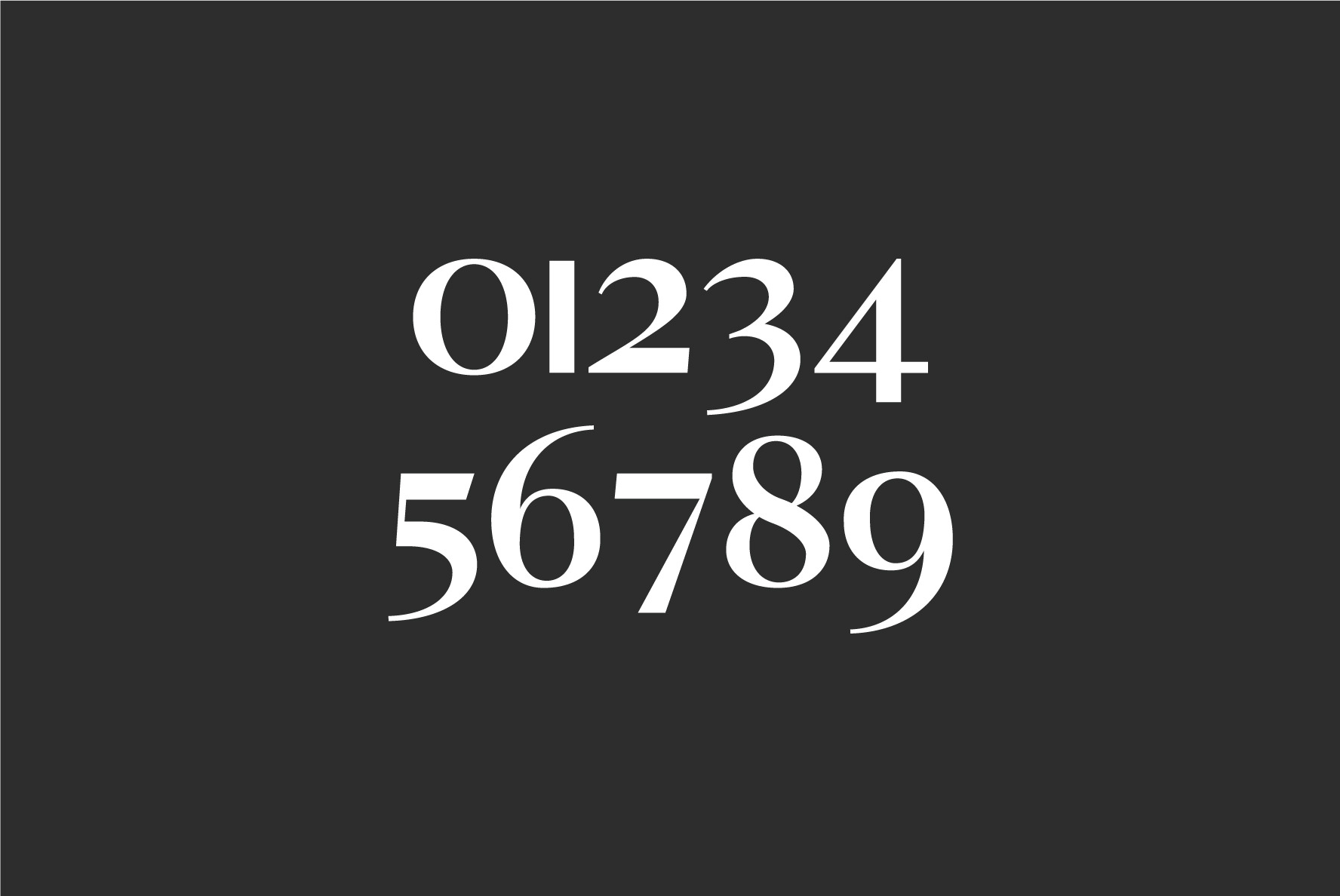
Senhan was originally conceived via an early AI tool called Prototypo. Then through a nearly year-long process of refinement and redesign the final typeface took shape. Defined by angular serif contours, this family of 5 weights and matching italics is a real eye-catcher at display sizes. But with a tall’ish x-height for legibility, and a medium contrast, Senhan is a workhorse in smaller, lengthy blocks of copy.
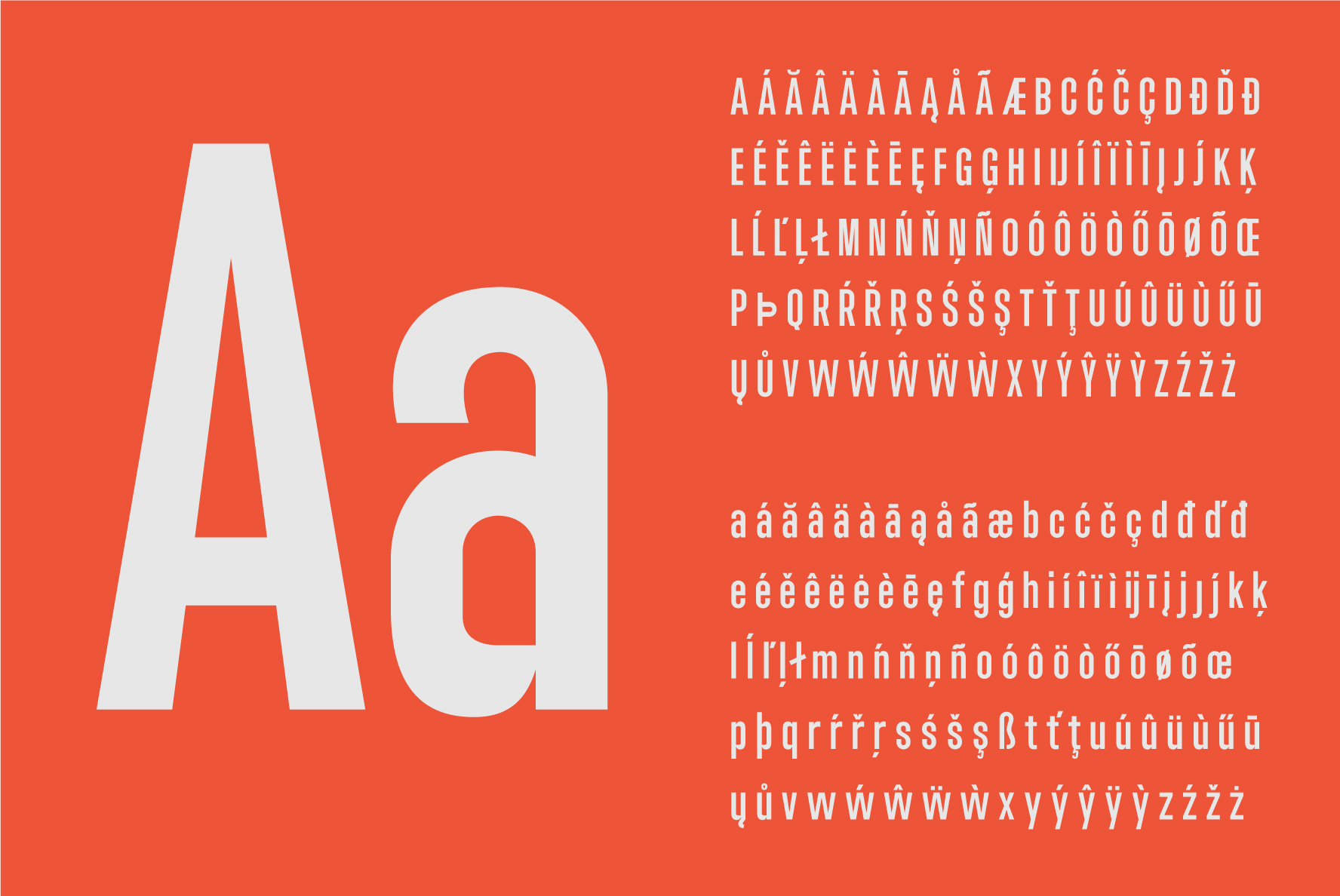
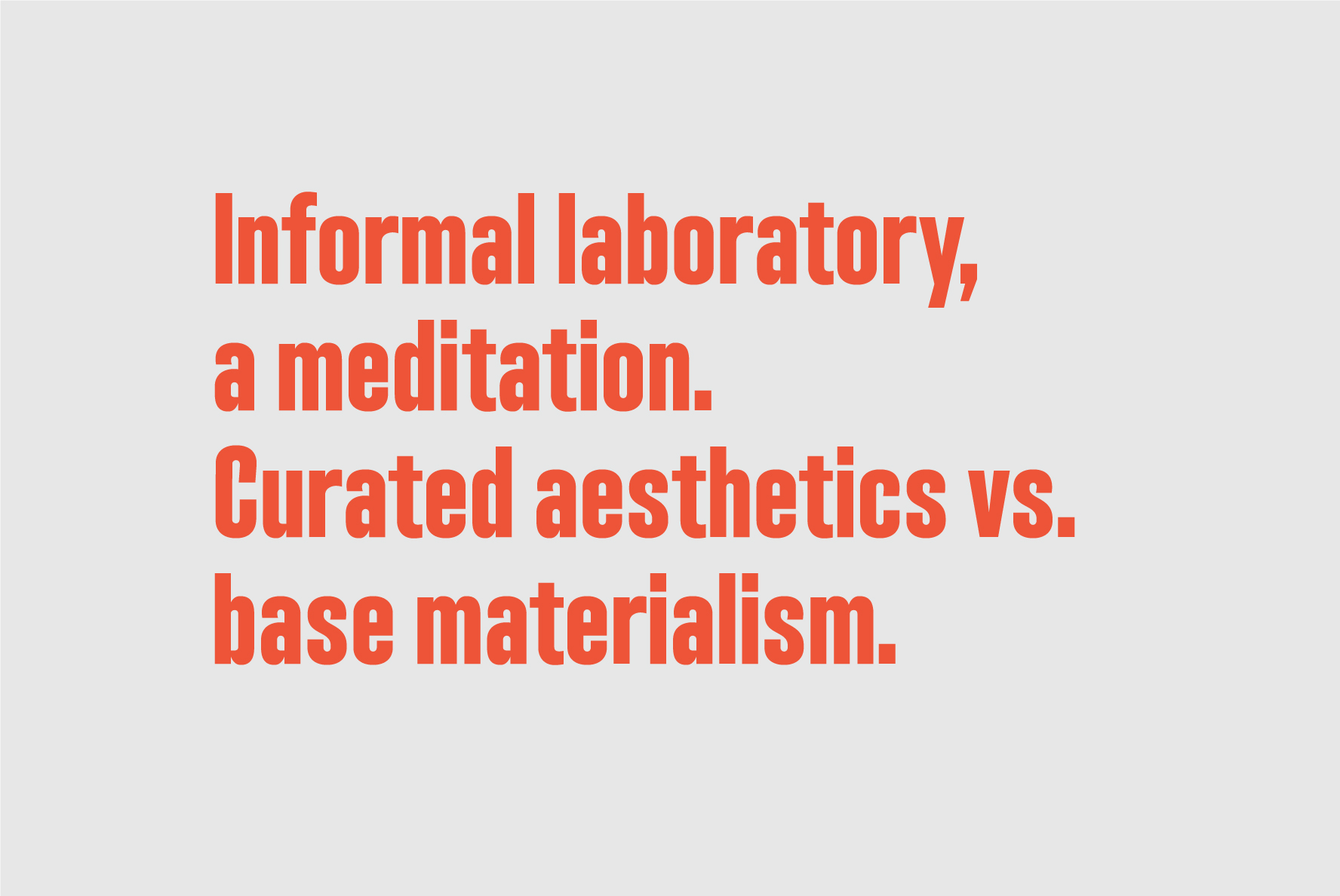
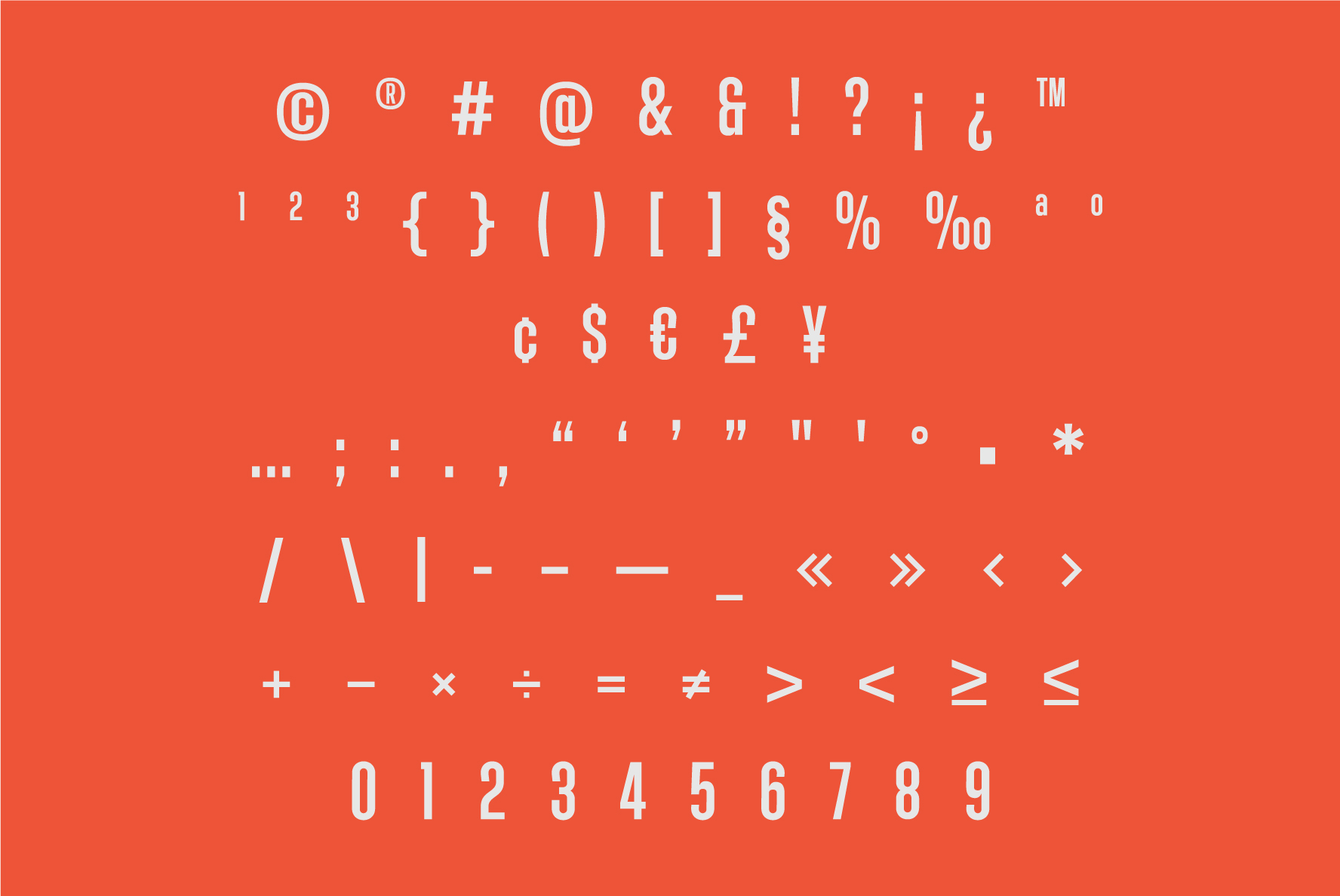
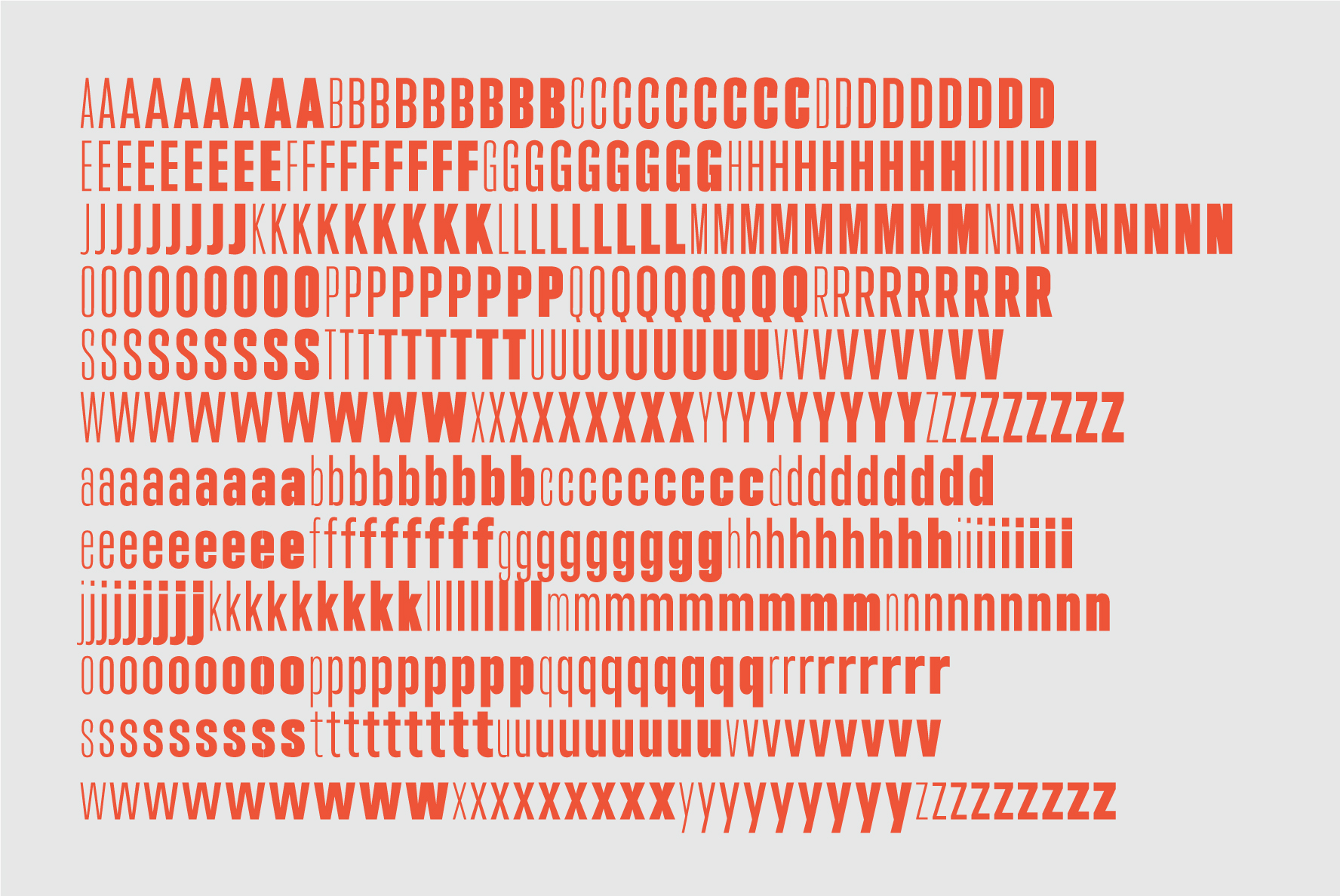
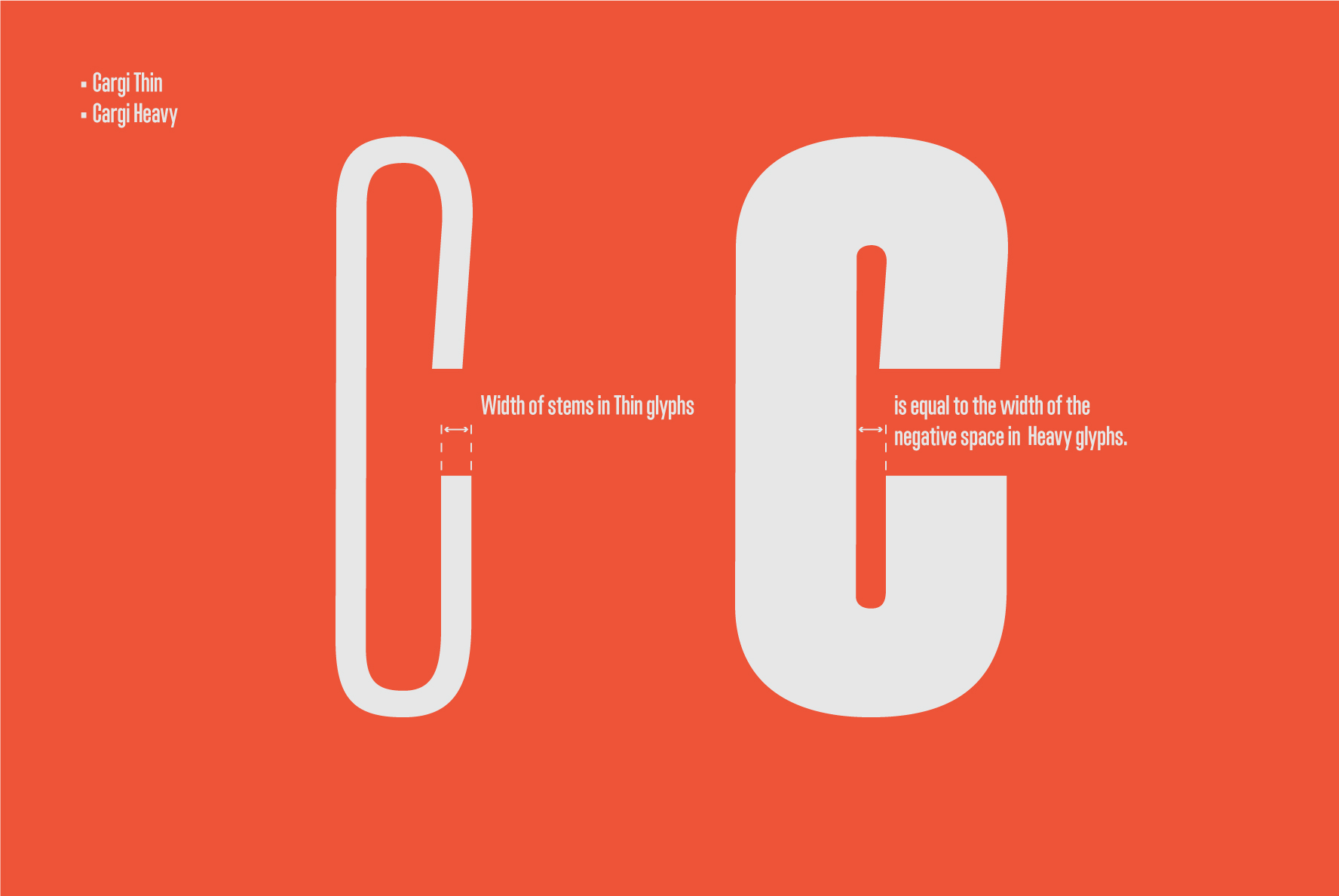
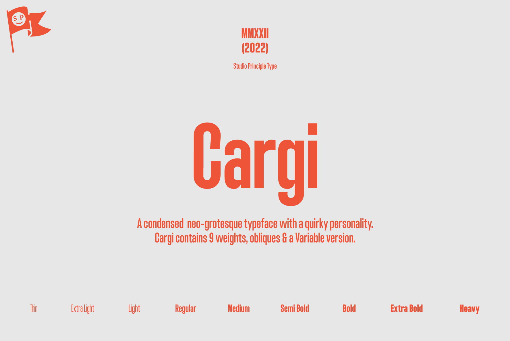
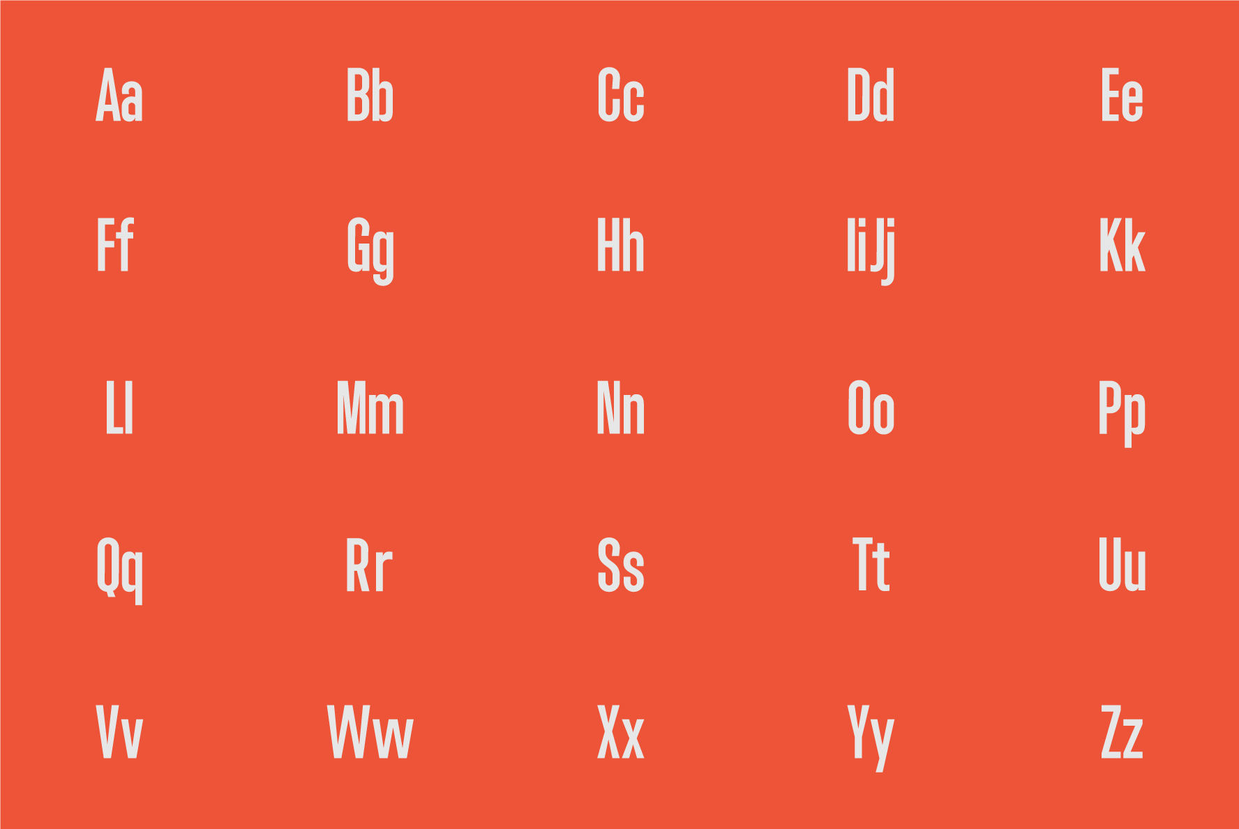
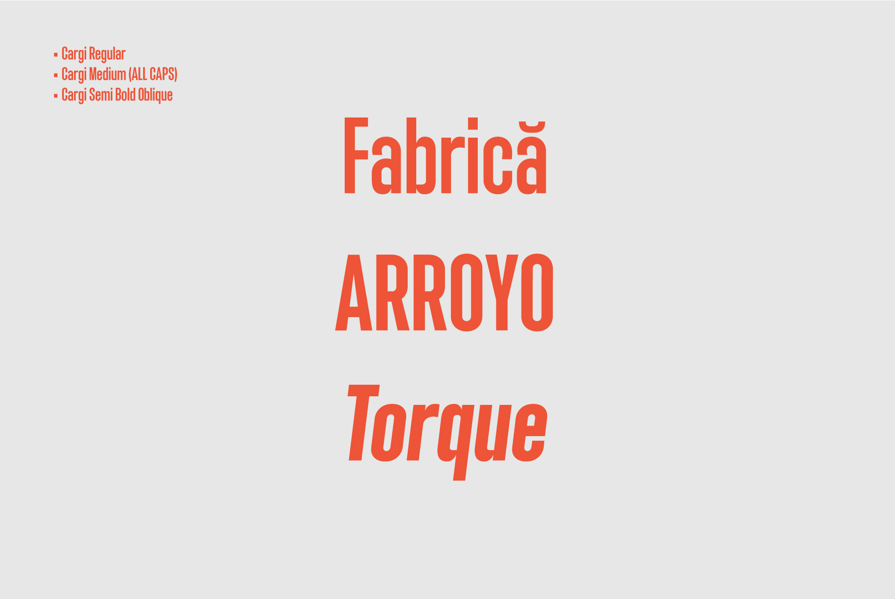
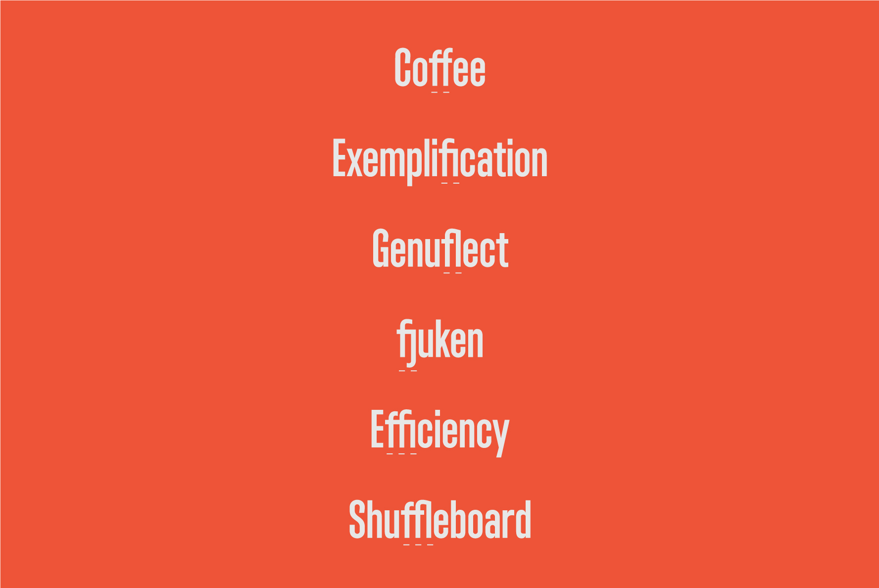
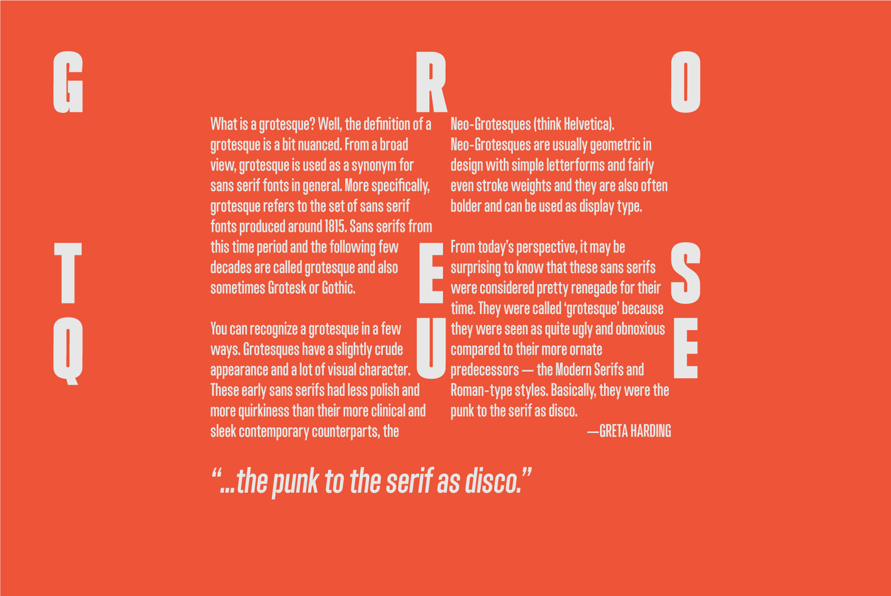
Cargi (scroll down) began as a short type course on LinkedIn. As the forms started to materialize, I found myself wanting to experiment with ways to breathe new life into a condensed neo-grotesque. I did so by employing quirky, atypical terminals and flattened out bowls. 9 weights, obliques and a Variable are available.
Desktop, webfont, ePub and mobile app licenses for both typefaces can be purchased at YouWorkForThem & MyFonts